Healthcare websites in New York must prioritize a mobile-first approach, focusing on fast load times, responsive design, simple navigation, local optimization, and accessibility compliance to maximize search visibility and patient engagement. With over 60% of healthcare searches happening on mobile devices and Google's mobile-first indexing making mobile experience the primary ranking factor, NYC clinics without optimized mobile sites lose patients to competitors who provide seamless smartphone experiences.
Mobile optimization isn't optional for NYC healthcare providers—it's the primary way patients discover and evaluate medical practices. From commuters searching for nearby urgent care on subway platforms to parents researching pediatricians at 2 AM, mobile devices dominate how New York patients find healthcare. Google now uses your mobile site as the primary version for indexing and ranking, meaning poor mobile performance suppresses all your rankings regardless of desktop quality.
Partnering with specialists in New York medical SEO ensures your mobile experience meets both patient expectations and Google's technical requirements. This guide reveals exactly how NYC healthcare websites can optimize for mobile search visibility and patient conversion.
Key Takeaways
- Responsive web design ensuring seamless adaptation across all screen sizes and orientations provides consistent user experience while satisfying Google's mobile-first indexing requirements that prioritize mobile-optimized sites in search rankings.
- Page speed optimization with compressed images and minimal code reduces load times below 3 seconds, dramatically decreasing bounce rates while improving Core Web Vitals scores that directly influence mobile search rankings.
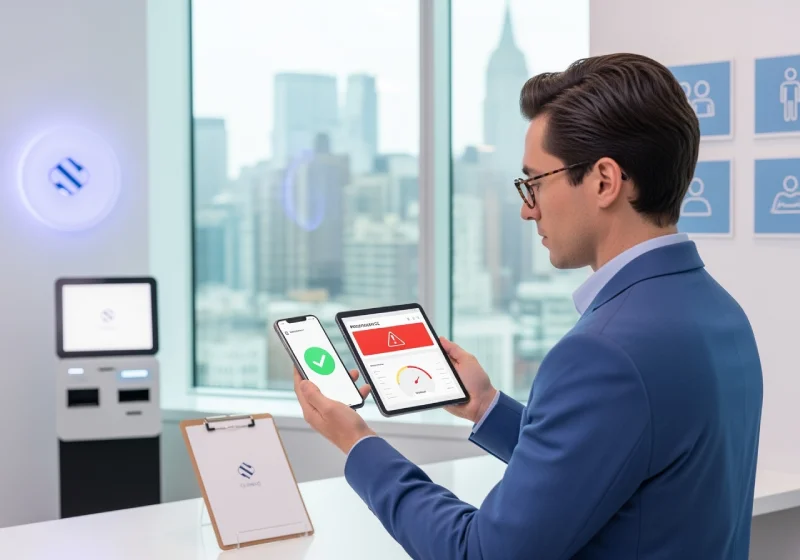
- Simplified mobile navigation with prominent CTAs like "Book Appointment" and "Call Now" enables quick access to critical services, converting mobile visitors into patients through friction-free interaction with your practice.
- Enhanced local SEO through Google Business Profile optimization and consistent NAP citations targets nearby patients searching for healthcare services, capturing the high-intent "near me" searches that drive immediate appointment bookings.
- Healthcare schema markup implementation enriches search results with structured data for local business, medical organization, and FAQ information, improving visibility in mobile search results and enabling voice search compatibility.
- ADA compliance with accessible design elements including proper color contrast, descriptive alt text, and keyboard navigation protects against legal liability while ensuring all patients can access your healthcare information regardless of disabilities.
Why Mobile SEO Matters for NYC Healthcare
Mobile devices fundamentally changed how New York patients discover and choose healthcare providers. Understanding these behavioral shifts helps prioritize mobile optimization investments that deliver maximum patient acquisition impact.
The mobile revolution in healthcare search shows dramatic statistics:
- 60%+ of all healthcare searches occur on smartphones
- 76% of mobile searchers for nearby services visit a business within 24 hours
- 28% of mobile local searches result in appointments within one day
- Google's mobile-first indexing uses mobile site as primary ranking signal
- 57% of users won't recommend businesses with poorly designed mobile sites
For NYC clinics, mobile search captures patients in high-intent moments—experiencing symptoms, seeking urgent care, or researching specialists while commuting. Failing mobile optimization means losing these patients to competitors with better mobile experiences.
Mobile-First Indexing Impact
Google predominantly uses your mobile site for indexing and ranking since 2019. Key implications include:
- Mobile site performance determines rankings for both mobile AND desktop searches
- Desktop-only optimizations provide no benefit if mobile experience is poor
- Separate mobile and desktop content creates indexing complications
- Mobile Core Web Vitals scores directly impact all search visibility
Responsive Design Fundamentals
Responsive web design forms the foundation of mobile SEO by automatically adapting content layout to any screen size. This single codebase approach simplifies maintenance while ensuring consistent experience across devices.
Core Responsive Design Principles
Effective responsive healthcare websites incorporate these essential elements:
- Fluid grid layouts that adjust proportionally to screen width
- Flexible images and media that scale within containers
- CSS media queries triggering different styles at breakpoints
- Touch-friendly interface elements sized appropriately for fingers
- Readable text without requiring zoom or horizontal scrolling
- Consistent branding and content across all device sizes
Avoid creating separate mobile websites (m.yoursite.com) which complicate SEO, split link equity, and create content synchronization challenges. Responsive design maintains single URL structure benefiting all ranking signals.
Testing Across Devices
NYC patients use diverse devices requiring comprehensive testing:
- iPhone models (iOS Safari)
- Android smartphones (Chrome, Samsung Browser)
- Tablets in both portrait and landscape orientations
- Various screen sizes from small phones to large tablets
- Different operating system versions
Use Google's Mobile-Friendly Test tool, Chrome DevTools device simulation, and real device testing to identify layout issues, touch target problems, and usability friction points affecting patient experience.
| Responsive Element | Mobile Requirement | Patient Impact | SEO Impact |
| Touch target size | Minimum 48x48 pixels | Prevents mis-clicks and frustration | Affects mobile usability ranking |
| Text readability | 16px+ font size, adequate line spacing | No zoom needed for reading | Improves engagement metrics |
| Navigation menu | Collapsible hamburger or simplified menu | Easy access to important pages | Affects crawlability and structure |
| Form fields | Large inputs, proper spacing | Easier completion on mobile | Improves conversion rates |
| Button placement | Thumb-friendly zones | Natural interaction patterns | Higher click-through rates |
| Image scaling | Responsive images serving appropriate sizes | Faster loading, clear visuals | Improves page speed scores |
Page Speed Optimization
Mobile users expect instant loading—delays of even 3 seconds increase bounce rates by 32%. NYC healthcare sites must prioritize speed optimization for both user experience and search rankings.
Image Optimization Strategies
Images typically account for 50-70% of page weight. Optimization tactics include:
- Compress images using tools like TinyPNG or ImageOptim
- Serve next-gen formats (WebP, AVIF) with fallbacks
- Implement lazy loading for below-fold images
- Use appropriate dimensions for mobile screens
- Specify width and height attributes preventing layout shift
- Consider CDN delivery for faster global access
Code and Resource Minimization
Reduce page weight and execution time through:
- Minify HTML, CSS, and JavaScript files
- Remove unused CSS and JavaScript
- Defer non-critical JavaScript loading
- Inline critical CSS for above-fold content
- Reduce HTTP requests by combining files
- Enable Gzip or Brotli compression
Caching and Server Optimization
Leverage browser caching by:
- Setting appropriate cache headers for static resources
- Using service workers for offline functionality
- Implementing CDN for faster content delivery
- Upgrading to faster hosting with SSD storage
- Optimizing database queries and server response time
- Using HTTP/2 or HTTP/3 protocols
Partnering with New York healthcare SEO services ensures technical optimizations follow healthcare-specific best practices while maintaining HIPAA compliance and accessibility standards.
Core Web Vitals Targets
Google's Core Web Vitals measure real user experience. Target scores include:
- Largest Contentful Paint (LCP): Under 2.5 seconds
- First Input Delay (FID): Under 100 milliseconds
- Cumulative Layout Shift (CLS): Under 0.1
- First Contentful Paint (FCP): Under 1.8 seconds
- Time to Interactive (TTI): Under 3.8 seconds
Mobile Navigation and User Experience
Simplified navigation helps mobile users quickly find appointment booking, contact information, and service details without frustration that drives them to competitor sites.
Streamlined Menu Structure
Mobile navigation requires ruthless prioritization:
- Limit top-level menu items to 5-7 essential categories
- Use clear, concise labels patients understand
- Implement collapsible sub-menus for additional options
- Place priority actions (Book, Call) outside hamburger menu
- Ensure menu items are touch-friendly with adequate spacing
- Include search functionality for direct access
Prominent Call-to-Action Buttons
Mobile users need immediate access to key actions:
- "Call Now" button with click-to-call functionality
- "Book Appointment" prominently displayed
- "Get Directions" linking to maps application
- "Message Us" for asynchronous communication
- Sticky headers keeping CTAs visible while scrolling
Position CTAs where thumbs naturally rest—lower portions of screen or easily accessible tap zones.
Content Formatting for Mobile
Text-heavy paragraphs overwhelm mobile screens. Optimize readability through:
- Short paragraphs (2-3 sentences maximum)
- Bulleted lists breaking up dense information
- Descriptive subheadings creating clear content hierarchy
- Adequate white space preventing visual clutter
- Concise sentences avoiding complex medical jargon
- Accordion menus hiding secondary information
| Mobile UX Element | Best Practice | Common Mistakes |
| Font size | Minimum 16px body text | Text requiring zoom to read |
| Line spacing | 1.5x line height minimum | Dense, cramped text blocks |
| Tap targets | 48x48px minimum touch area | Tiny links causing mis-clicks |
| Forms | Single column, large inputs | Multi-column layouts on mobile |
| Pop-ups | Avoid or use exit-intent only | Intrusive interstitials blocking content |
| Horizontal scrolling | Never required | Tables or images extending beyond viewport |
Local SEO for Mobile Healthcare
Mobile searches with local intent ("urgent care near me," "pediatrician in Brooklyn") represent highest-value patient acquisition opportunities. Optimizing for local mobile search captures these high-intent patients.
Google Business Profile Optimization
Your GBP serves as primary mobile discovery tool. Complete optimization includes:
- Accurate business information (name, address, phone)
- All relevant service categories selected
- High-quality photos (exterior, interior, staff, services)
- Regular posts (2-3 weekly) with updates
- Prompt review responses (within 24-48 hours)
- Messaging enabled for patient inquiries
- Appointment booking integration when available
- Updated hours including holidays and special schedules
Mobile users frequently discover practices through Google Maps and Local Pack results making GBP optimization critical for visibility.
NAP Consistency Across Directories
Consistent business information strengthens local rankings:
- Exact name match across all platforms
- Identical address formatting everywhere
- Same phone number on all listings
- Consistent category selections
- Updated information after any changes
Major healthcare directories requiring consistent NAP include:
- Healthgrades
- Zocdoc
- Vitals
- WebMD Physician Directory
- RateMDs
- Yelp
- Apple Maps
Location Pages for Multiple Offices
Practices with multiple NYC locations need individual pages for each:
- Unique content for each location (not duplicated)
- Specific address and contact information
- Neighborhood-relevant content and keywords
- Directions from major landmarks and transit
- Individual GBP listings for each office
- Location-specific patient testimonials
This hyperlocal approach captures "near me" searches from different NYC neighborhoods.
Healthcare Schema Markup
Structured data helps search engines understand your medical content while enabling rich results that improve mobile visibility and click-through rates.
Essential Schema Types for Healthcare
Implement these schema markup types:
- LocalBusiness schema: Basic practice information, hours, location
- MedicalBusiness schema: Healthcare-specific details, specialties
- Physician schema: Provider credentials, board certifications
- MedicalOrganization schema: Organizational structure, affiliations
- FAQPage schema: Frequently asked questions for featured snippets
- Review schema: Patient ratings and reviews display
Schema implementation through JSON-LD format in page head or structured data plugins ensures search engines properly interpret your healthcare content.
Voice Search Optimization
Voice search usage grows rapidly on mobile devices. Optimize for voice queries by:
- Targeting conversational, question-based keywords
- Creating comprehensive FAQ sections
- Using natural language in content
- Implementing FAQPage schema markup
- Optimizing for featured snippet positions
- Providing concise, direct answers to common questions
Voice searches often include location qualifiers ("near me," neighborhood names) requiring strong local SEO signals.
| Schema Type | Mobile Search Benefit | Implementation Priority |
| LocalBusiness | Enables map display, location info | Critical - Implement first |
| MedicalBusiness | Healthcare-specific rich results | High - Core medical signal |
| Physician | Provider expertise display | High - Builds trust |
| FAQPage | Featured snippet eligibility | High - High visibility |
| Review | Star ratings in search results | Medium-High - Social proof |
| BreadcrumbList | Enhanced navigation display | Medium - Improves clarity |
Mobile Forms and Conversion Optimization
Mobile form design directly impacts appointment booking rates. Friction in mobile forms costs patient conversions and practice revenue.
Mobile-Friendly Form Design
Optimize forms for smartphone completion:
- Single-column layouts preventing horizontal scrolling
- Large input fields easy to tap accurately
- Appropriate input types (tel, email, date) triggering correct keyboards
- Auto-complete enabled reducing typing
- Clear error messages explaining required corrections
- Progress indicators for multi-step forms
- Minimal required fields reducing abandonment
Appointment Booking Integration
Seamless mobile booking converts patients immediately:
- Prominent "Book Appointment" buttons on every page
- Mobile-optimized scheduling interface
- Calendar integration showing available times
- Confirmation via SMS and email
- Ability to select specific providers
- Insurance verification during booking
Consider implementing third-party scheduling tools like Zocdoc or Acuity that provide mobile-optimized booking experiences.
Click-to-Call Functionality
Phone calls remain primary mobile conversion for healthcare:
- Clickable phone numbers throughout site
- Proper tel: link formatting for instant dialing
- Visible phone numbers in headers/sticky menus
- Call tracking for marketing attribution
- Business hours displayed near phone numbers
Implement New York medical website design that prioritizes mobile conversion through strategic CTA placement and friction-free interaction.
Accessibility and ADA Compliance
Mobile accessibility ensures all patients can access healthcare information regardless of disabilities while protecting against legal liability under ADA requirements.
Core Accessibility Requirements
Essential accessibility features include:
- Sufficient color contrast ratios (4.5:1 minimum for text)
- Descriptive alt text for all images
- Semantic HTML with proper heading hierarchy
- Keyboard navigation for all interactive elements
- ARIA labels for screen reader compatibility
- Visible focus indicators for keyboard users
- No reliance on color alone to convey information
Mobile-Specific Accessibility
Additional considerations for mobile accessibility:
- Touch targets sized appropriately (48x48px minimum)
- Avoid time-limited actions requiring quick response
- Orientation support (both portrait and landscape)
- Zoom capability without breaking layout
- Clear error identification in forms
- Consistent navigation patterns
Accessibility Testing Tools
Verify compliance using:
- WAVE browser extension for automated checks
- Lighthouse accessibility audit in Chrome DevTools
- Screen reader testing (VoiceOver on iOS, TalkBack on Android)
- Keyboard-only navigation testing
- Color contrast analyzer tools
Non-compliance risks both losing patients unable to access your site and potential ADA lawsuits costing tens of thousands in settlements.
Mobile Content Strategy
Mobile-optimized content requires different formatting and organization than desktop content to accommodate smaller screens and shorter attention spans.
Content Formatting Best Practices
Structure mobile content for scannability:
- Front-load important information
- Use descriptive subheadings every 2-3 paragraphs
- Break content into bulleted lists
- Keep paragraphs to 2-3 sentences
- Implement accordion menus for secondary details
- Include table of contents for long pages
Video Content Optimization
Video increasingly engages mobile users but requires optimization:
- Compress videos for faster mobile loading
- Include captions for sound-off viewing
- Keep videos under 2 minutes when possible
- Use responsive video embeds
- Provide transcript text for accessibility
- Thumbnail images enticing clicks
Mobile-First Content Planning
Plan content with mobile experience as priority:
- Prioritize essential patient information
- Defer secondary details to expandable sections
- Create mobile-specific shorter versions when appropriate
- Test readability on actual mobile devices
- Verify all links and buttons work on touch screens
Performance Monitoring and Testing
Ongoing monitoring ensures mobile experience remains optimized as content, traffic patterns, and Google requirements evolve.
Key Mobile Metrics to Track
Monitor these critical indicators:
- Mobile organic traffic trends
- Mobile vs. desktop conversion rates
- Core Web Vitals scores (LCP, FID, CLS)
- Mobile bounce rate and engagement time
- Mobile keyword rankings
- Mobile page speed scores
- Form completion rates on mobile
Testing Tools and Resources
Essential tools for mobile optimization:
- Google Search Console (Mobile Usability report)
- PageSpeed Insights (mobile performance analysis)
- Mobile-Friendly Test (basic compatibility check)
- Chrome DevTools (device simulation and debugging)
- Real device testing across multiple phones/tablets
- User session recordings showing mobile behavior
Continuous Improvement Process
Establish regular optimization cycles:
- Monthly Core Web Vitals review
- Quarterly comprehensive mobile audits
- Regular testing on new device models
- A/B testing of mobile CTAs and layouts
- Patient feedback collection on mobile experience
Working with New York SEO for medical practices specialists ensures mobile optimization stays current with evolving best practices and algorithm updates.
Conclusion
Mobile optimization fundamentally determines healthcare website success in New York's competitive market. With mobile-first indexing, Core Web Vitals ranking impacts, and dominant mobile search behavior among NYC patients, clinics must prioritize responsive design, page speed, simplified navigation, and local SEO signals to capture patient searches effectively.
Implementation of mobile best practices—fast loading times, accessible design, prominent CTAs, and seamless booking—converts mobile visitors into appointments while satisfying Google's technical requirements. Contact our team to audit your mobile experience and implement optimization strategies that improve both search rankings and patient conversion rates.
Frequently Asked Questions
Why is mobile SEO more important for healthcare websites than desktop?
Over 60% of healthcare searches occur on mobile devices, and Google uses mobile-first indexing meaning your mobile site determines rankings for all devices. Poor mobile experience suppresses both mobile and desktop search visibility while losing high-intent patients searching for nearby providers on smartphones.
How fast should my healthcare website load on mobile devices?
Target under 2.5 seconds for Largest Contentful Paint (LCP) to achieve "good" Core Web Vitals scores. Pages loading over 3 seconds see bounce rates increase 32%, and delays beyond 5 seconds lose over 50% of mobile visitors before content even displays.
What's the difference between responsive and mobile-friendly design?
Mobile-friendly means your site is usable on mobile devices but may have separate mobile version (m.site.com). Responsive design uses single codebase automatically adapting to any screen size, which Google strongly prefers for avoiding duplicate content issues and maintaining consistent link equity.
How do I optimize my Google Business Profile for mobile search?
Complete all information fields including categories, hours, and descriptions; add 10+ high-quality photos; post updates 2-3 times weekly; respond to all reviews within 48 hours; enable messaging; integrate appointment booking; and ensure NAP consistency with your website and other directories.
Does my mobile site need different content than desktop?
Use the same comprehensive content but format differently for mobile with shorter paragraphs, more subheadings, bulleted lists, and accordion menus hiding secondary details. Never hide important content on mobile as Google may not discover it, harming rankings.
What mobile accessibility features are legally required for healthcare websites?
ADA compliance requires sufficient color contrast, alt text for images, keyboard navigation, screen reader compatibility, and semantic HTML structure. While specific requirements remain debated legally, implementing WCAG 2.1 AA standards provides strong protection against lawsuits.
How do I test if my healthcare website is truly mobile-optimized?
Use Google's Mobile-Friendly Test and PageSpeed Insights for automated analysis, test manually on multiple real devices (iPhones, Android phones, tablets), check Core Web Vitals in Search Console, simulate various screen sizes in Chrome DevTools, and collect patient feedback on mobile experience.
Can poor mobile experience affect my desktop search rankings?
Yes—Google's mobile-first indexing uses your mobile site as primary ranking signal for both mobile and desktop search results. A healthcare site with excellent desktop experience but poor mobile performance will rank poorly across all devices because Google evaluates mobile version first.
How often should I update my mobile website optimization?
Conduct comprehensive mobile audits quarterly, monitor Core Web Vitals monthly, test on new device models when released, and implement continuous improvements based on performance data. Mobile optimization is ongoing process not one-time project as devices, user behavior, and Google requirements constantly evolve.
What's the most common mobile SEO mistake healthcare websites make?
Slow page speed from unoptimized images and excessive scripts prevents good Core Web Vitals scores and frustrates patients. Many healthcare sites also hide important content or remove features on mobile, create forms difficult to complete on small screens, or neglect local SEO signals critical for "near me" searches.